![[Metroactive Arts]](/arts/gifs/art468.gif)
No Place Like It
Our notions of home are turned inside out at the de Saisset
By Ann Elliott Sherman
THERE IS something disorienting about a juxtaposition of art pieces that includes everything from foamcore-and-photo mockups of university dorm rooms to bumper stickers posing the concept of "hereness" to shopping carts made to look like Conestoga wagons.
It is conceivable that the point of Home, the current exhibit at the de Saisset Museum, is to provide a heightened awareness of the extreme variations in perspective on its eponymous subject. Unfortunately, the show lacks the very quality that makes a dwelling more than physical shelter: a sense of unity or connection between the physical, mental and spiritual environs.
Seyed Alavi's stickers (which are intended to be picked up and taken away by museum goers) intoning "There Is No Place Like Here" were right at home in their earlier setting: a Euphrat Museum exhibition of art originating in the immigrant experience. Here, the self-serve rack stocked with this existential spin on Dorothy's familiar mantra from The Wizard of Oz stands near Elaine Badgley-Arnoux's phalanx of shopping carts. Alavi's intellectual grappling with the idea of home loses its wry punch when it is seen in such close proximity to a symbol of pragmatic attempts to circumvent the lack of one.
As for the line of oil-on-canvas-covered shopping carts, the set-up of Badgley-Arnoux's The New Frontier as a united front seems off-base, although it is no doubt intended to force a confrontation. More likely, these carts would be isolated in some dark corner or rounded up by a cleanup brigade.
The choice of materials used for the covers also seems to indicate a desire to mythologize a gritty reality more closely associated with plastic trash bags. Why not force viewers to re-examine their knee-jerk response to the actual stuff they see/ignore every day, and so confront the difference between wanderers of yesteryear and today? This task is left to the personal saga of a homeless individual painted on the plastic child's seat of each cart. Luckily, these articulate stories--have been carefully thought out, causing us to see the narrators as fellow human beings.
In Threads, her series of paintings, Badgley-Arnoux focuses attention not on the homeless but on the willful blindness of society--represented by a woman with a scarf tied over her head--to life on the streets. Although the contrast between this see-no-evil figure and some carved lion statues paying close attention to what's going on is a clever metaphor, the rest of the symbolism falls short in communicating the intended message described in the earnest curatorial statement.
Landscapes for the Homeless is the self-explanatory title of Anthony Hernandez's Cibachrome photo essay documenting the nooks and hidey-holes around L.A. where homeless people lay their heads. Though he manages to avoid sawing on the violin strings, playing it fairly straight with shots of scattered trash, beds and even porn stashed in the bushes, Hernandez still shows that he has the eye of a true artist.
His two-frame sequence of a hollow blanketed with thousands of cigarette butts smoked right down to their filters is both a mind-boggling document and a well-composed near-abstraction. One shot of spoiled produce, meat trays and a lemonade can embedded in the soil has an archeological flavor; another shot of an improvised cooking pit captures its function as well as the interesting visual contrasts between ashes, eggshells and manzanita wood.
Without being maudlin, Hernandez presents plenty of poignant evidence of people's attempts to create some order or privacy. These efforts range from the spartan ingenuity of using a stick as a pants hanger to stringing up an appliance-box wall, complete with cutout windows, beneath an overcrossing.
The disturbing combinations of broken-down shoes, prescription vials, shattered glass and the like mixed in with a schoolchild's reader, a clown bank and an old Happy Meal box serve as reminders of the real demographics of homelessness.
With the exception of a dun-colored coat flecked with goldenrod, the color in Hernandez's landscapes is as incidental as it must be to their inhabitants. I suspect that he pursued this strategy in order to drive home the prosaic nature of these scenes while avoiding the "high art" associations of black-and-white prints. By simply showing us how and where those on the margins live, Hernandez awakens the viewer's conscience into empathy for those they might rather not think about in such concrete terms.
[ Metro | Metroactive Central | Archives ]
Copyright © Metro Publishing Inc. Maintained by Boulevards New Media.
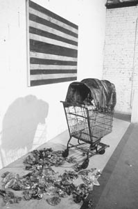
Wanderers Then and Now: One of the phalanx of decorated shopping carts in Elaine Badgley-Arnoux' installation 'The New Frontier' reminds viewers that even the pioneers were homeless until they found a place to settle.
Home runs through Dec. 5 at the de Saisset Museum, Santa Clara University. (408/554-4528)
From the Nov. 20-26, 1997 issue of Metro.