![[Metroactive Arts]](/arts/gifs/art468.gif)
Turning Words into Images
Printmakers turn to verse in 'PRINTed poem' exhibit at WORKS
By Ann Elliott Sherman
IN OCTOBER 1996, a group of artists calling themselves the Silicon Valley Printmakers joined forces to expand the vocabulary of their medium by combining it with other two-dimensional techniques. The only rule laid down for the printing experiments was that each work must somehow incorporate the monotype method.
The results of the collaborative exploration on view in PRINTed poem at WORKS/San Jose are personal meditations focused on the internal as well as external creative process. These artists were more interested in stretching printmaking boundaries to better realize their visions, as opposed to reaching a new audience or gaining membership in an avant-garde.
The poetic theme was determined after the fact, dictated by the common thread of words and symbols apparent in the prints. It's a quiet show, dominated by works that seek to make life more comprehensible while respecting its mysteries. The pieces represent the kind of personal poetry that arises from integral necessity. These are not performances designed to impress an audience with bravura and accessible style over substance.
Valerie Magee's Le Rovine Romane (The Roman Ruin) series mixes collage with monotype and other media to create compelling, dramatically staged landscapes that seem to function equally well as studies of the architecture of the soul. No. 14 "Parlo almeno in vano..." ("Speak at least in vain...") puts the viewer in a puzzling subterranean maze of vaulted ceilings, arches and columns seen in shadow, reflection and moonlight. One archway leads out to an open ruin visible in the near distance, creating a sense of an inner journey from secrecy, confinement and confusion toward revelation.
Recombining a symbolic argot of time pieces and rings, crows and feathers, crosses and crosswords in a series of small, almost iconic works pairing monotype and the appliqué technique known as chine colle, Mercy Smullen also charts an allegorical journey. Just as the palette of muted golds and greens suddenly blazes into flame, the religious trappings, various symbols of marking time and ghosted feathers in compartmentalized panels give way to the freed motion of wings in flight in Fly Away.
That ominous messenger, the crow, crops up again in Judith Juntura Miller's viscosity prints exploring our human need to express the ineffable. Faux-naif line drawings of houses, flowers, roots and various symbols (all inexact yet familiar stand-ins for reality or ideas) frame black-and-white digital images of stone walls, swallow's nests or stepping stones bearing crudely scrawled quotes that examine the dubious reliability of words versus their healing power.
THE EFFECTIVENESS of the childish script in Miller's pieces stands in direct contrast to the syrupy digital calligraphy Ellen Kiefer chose for the text in most of her P.O.E.M. (Postcard of Ensuing Memory) series. When combined with the dominant presence of pink and purple, the effect is unfortunately reminiscent of those saccharine, rainbow-hued greeting cards bespeaking "Deep Thoughts."
One piece, #52, however, escapes this fate, due in no small part to Kiefer's use of her own handwriting, subtle moonlight hues and dreamily recurrent chimney-nesting doves, trumpet flowers and a clever cloud-drifted moon that doubles as a postmark.
Yeung Ha's layered odes to parental teachings borrow more freely from contemporary graphic strategies than do the pieces of many of her colleagues. In Hygeia to Mom, "quilt" blocks are printed over a city map of Fremont collaged with acupuncture diagrams and corn-husk "tea bags" tagged with maternal dietary advice.
Sometimes, however, the message transmutes between generations. Ha's Focal Point cleverly maps her parents' traditional view of one path to success in a mix of English text and Chinese mountain landscape and characters superimposed with a transportation diagram painted on the framing glass. Their single route to the summit becomes multiple Points of Connection along intersecting routes when the watchword shifts from "success" to "choices" in the artist's companion lesson to her children.
Grace Purpura's figurative monotypes inscribed with lines from various poems are without doubt the most direct pieces, the kind of thing the exhibition's title might lead one to expect. The brightly colored waist-down female forms topped with flaming hearts have a folk-art, almost posterlike clarity. This directness is well suited to poet Bernice Zamora's accompanying no-nonsense riposte "You insult me/when you call me schizophrenic/I have many more facets."
The relative simplicity of Purpura's work is a refreshing breather from the show's often involved introspection. It fails, however, to offer the kind of innovations in approach or combinations of media that the Silicon Valley Printmakers banded together to find. Their collective efforts have brought a contemporary complexity to a venerable art form.
[ San Jose | Metroactive Central | Archives ]
Copyright © Metro Publishing Inc. Maintained by Boulevards New Media.
![]()
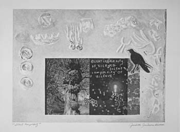
Silent Complexity: Judith Juntura Miller's prints explore our human need to express the ineffable.
PRINTed poem runs through May 30 at WORKS/San Jose, 30 N. Third St., San Jose. A poetry reading featuring Lequita Vance-Watkins will be held Thursday (May 21) at 7pm. (408/295-8378).
From the May 21-27, 1998 issue of Metro.