
He Put the X in X-Files
Fifteen minutes of font fame
By Larry Smith
Netherlands-based designer and font maker, Erik van Blokland creates hot type for Metro Newspapers, among other spots. But clearly van Blokland owes his 15 minutes of font fame to Trixie, a font he created in 1991 that has achieved cult status as the X in the X-Files. He also runs LettError, a virtual studio he shares with Just van Rossum, which explores the does and don'ts of type.
Metro: So Erik, what's Trixie's story?
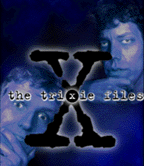
van Blokland: A long time ago, in the summer of 1990, my colleague and I went to a typography conference in England. We had just figured out a way to scan images, and then vectorise the images and put them in a font. This was way before grunge type, or dirty faces. We started making these rough, broken letters and really liked them. One of the ideas was to digitize our handwriting and make fonts from them. Something considered utterly silly in those days because hadn't been done before. One other idea was to digitize a typewriter typeface. Not like courier or elite, but the way real typewriters look on paper. Beat up. Broken. Dirty. Later that year I found a suitable typewriter at the house of a friend in Berlin, Beatrix Gunther, or Trixie, as everybody calls her. Her typewriter was suitable and so was her name. I offered the fonts to FontShop International, and they decided to publish it. Now it is used all over the world. At some point, someone at Warner must have looked for an idea for the X-Files TV series, and looked for something that would fit a musty paranoiac bureaucratic environment and bought (I hope) the font. Perhaps the fact that there is an 'X' in the name of the font helped to make the connection. Now I spent the weekends telling people in the Usenet discussion group that the X-Files font is actually called Trixie, and that this font is not freeware. Most of them understand, some don't. At one point, responding to yet another "post X-Filefont" message, I posted a note saying that "the typeface Trixie was the one and only original X-Files typeface, and that any rumors stating the opposite, or claiming some other font was the true X-Files font was a mean and vicious rumor spread by your government." There was one answer to that: "What a load of political bullshit." I guess not all people watch TV. Scary.
Metro: Do bad things happen to good fonts?
van Blokland: Yes. Another typeface I made was used in a campaign for Helmut Kohl's German conservative party. There was a front page picture in some German newspaper with Kohl standing in front of a massive billboard with (my) letters two feet high. That's also the typeface that is used in some if the Dumb and Dumber material. I'm making a Web page with these two images juxtaposed.
[ Metro | Metroactive Central | Archives ]
This page was designed and created by the Boulevards team.
Copyright © 1996 Metro Publishing, Inc.